2X Growth for blogs which increased the AQL pipeline by 51%
within the first 6 months.

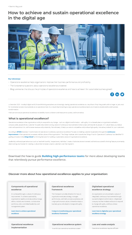
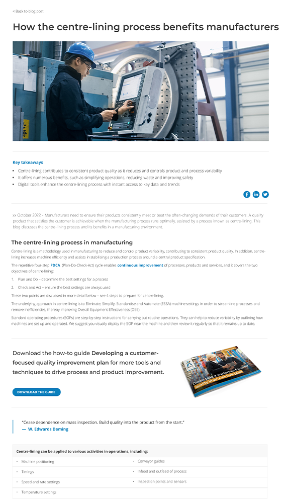
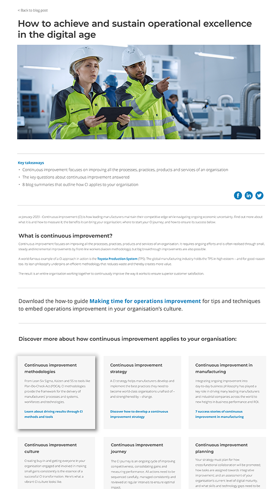
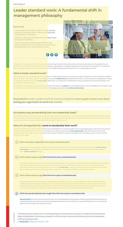
The Marketing team set out to deliver more engaging and personalised content to increase the sales funnel with more marking contributing leads. The challenge was to simplify the messaging and create less noise. This way the design does not interfere with the primary task that the customer has. Which is achieving their goal in the shortest possible amount of time. Therefore, it was essential to remove all unnecessary elements and polish existing elements for maximum clarity. It was important to make the UI easily digestible. Not to overload with too much information, and make sure to optimize both content and functional elements for fast scanning.
In a time of information overload, visuals are an engaging way to not overwhelm viewers with tons of text. At the top of the high-performing visual list are infographics. We were focusing on clear rewarding CTA's to gated content to increase the number of customers entering our nurture streams.
• Lack of understanding of source data and lack of proper testing
• Ineffective validation of specifications
• Removing all unnecessary elements for maximum clarity.
• Clear call-to-actions and pop-up designs.
To create a proper solution for the problem, it was essential to look at the user interactions with our webpages holistically. That is why it is vital to understand what typical interactions will look like. Once we understood, we started to visualise and map out the journey. It is possible to use various techniques for this. I recommend using a user journey map and storyboarding. A user journey map is an excellent tool for CRO (Conversion Rate Optimisation) because it visualises how a user interacts with a product and allows us to see a product/journey from a user’s point of view.
To analyse our website data, we acquired Hotjar for qualitative data and Google Analytics and Power Bi for quantitative data. This enabled us to have an holistic view and discover behaviours, trends and pain points.
• Anticipate the natural progression of the task.
• Minimise eye movements by aligning screen elements into groups.
• Minimise interaction cost (hand or finger movements).
• Optimise elements for fast visual scanning.
• Create a proper visual hierarchy of elements.
Information is easy to scan and read. The arrangement of elements on the page guides users to what they need first, second, and so on.
Left only elements that are the most important for user task. Optimised both content and functional elements for fast visual scanning. F-shape, Z-shape, and E-shape for blogs.
Prominently featured crucial functions and hid less frequently used functions.
Insured all internal links stood out. This led to more downloads and form submissions.
We worked on a content strategy extremely targeted to our buyer persona's needs and pain pionts.
Included motivations, buying triggers and questions customers ask themselves along the way during the buying process.
Wherever the CTA appears, it should be visually obvious, tell the visitor specifically what they are going to get and remind people that it is good.
The colour contrasts with the colours around it, especially the button.
Answered the question, “what’s in it for me?"
Showcasing other major clients who has achieved great results.


All digital and printed material used to communicate or promote the company's brand message, products, or services was rewritten and redesigned. Core purpose:
• Increase lead generation.
• Leads to more sales.
• Segmentation and measurements of the analytics.